Abacus Solutions
In 2020, Abacus Solutions underwent corporate restructuring, separating its hardware brokerage business from its cloud and managed services business. The carveout provided Abacus with the opportunity to redesign the company website and make it a destination for potential customers to find best-in-class cloud solutions and managed services.
- What I did: Content Design, UI Design, UX Design, Information Architecture
- Client: Abacus Solutions / Internal
- Timeline: 4 months
- Role: Project Lead / Primary UX Designer
Problem
Stakeholders at Abacus wanted the new company website to be the primary source for new business leads. With that goal in mind, the existing website needed to refocus its messaging by migrating all hardware-related content to a separate site and updating the remaining content to showcase our niche solution offerings.
Our biggest obstacle was accounting for the many names the industry had for the specific platform our solutions were tailored to: IBM i was also known as AS/400, System i, iSeries, and Power Systems. The new Abacus Solutions website would need to accommodate the interchangeability of these names while still being accessible, easy to navigate, and visually engaging to visitors.
Solution
Because I was a design and marketing team of one, we hired an external marketing partner to support the work needed for a project of this scale. I coordinated with their project manager and design team, paying close attention to search engine optimization (SEO) to improve the company’s search engine rankings and implementing conversion rate optimization (CRO) strategies to better capture leads.
Results
In a competitor analysis, Abacus consistently ranked higher in search engine results for keywords that were essential to our business. We were often in the first position in Google search engine rankings for keywords like AS400 DRaaS (Disaster Recovery as a Service), AS400 Managed Services, and AS400 BaaS (Backup as a Service).
Leads
Closed Deals
Reducing the bloat
The original Abacus Solutions website had a substantial bloat problem, the result of work performed by a previous external partner hired to improve the website’s SEO with content creation. Cutting out anything related to the hardware brokerage business was easy, but the real challenge lay in consolidating 550+ IBM i-related pages, many of them redundant, down to a sitemap that was more manageable and effective.
I worked with my supervisor to identify a list of keywords that best represented our core business and used this list to guide the consolidation process. Landing pages were generated out of all the redundant content and 301 redirect rules were implemented to bring the site’s total page count down to 115. By reducing the amount of low quality content, our aim was to improve the quality score of the website and improve its Google search engine rankings, which in turn would help drive more organic traffic to the site.

Reorganizing our solution offerings
Abacus customers usually fell into two categories:
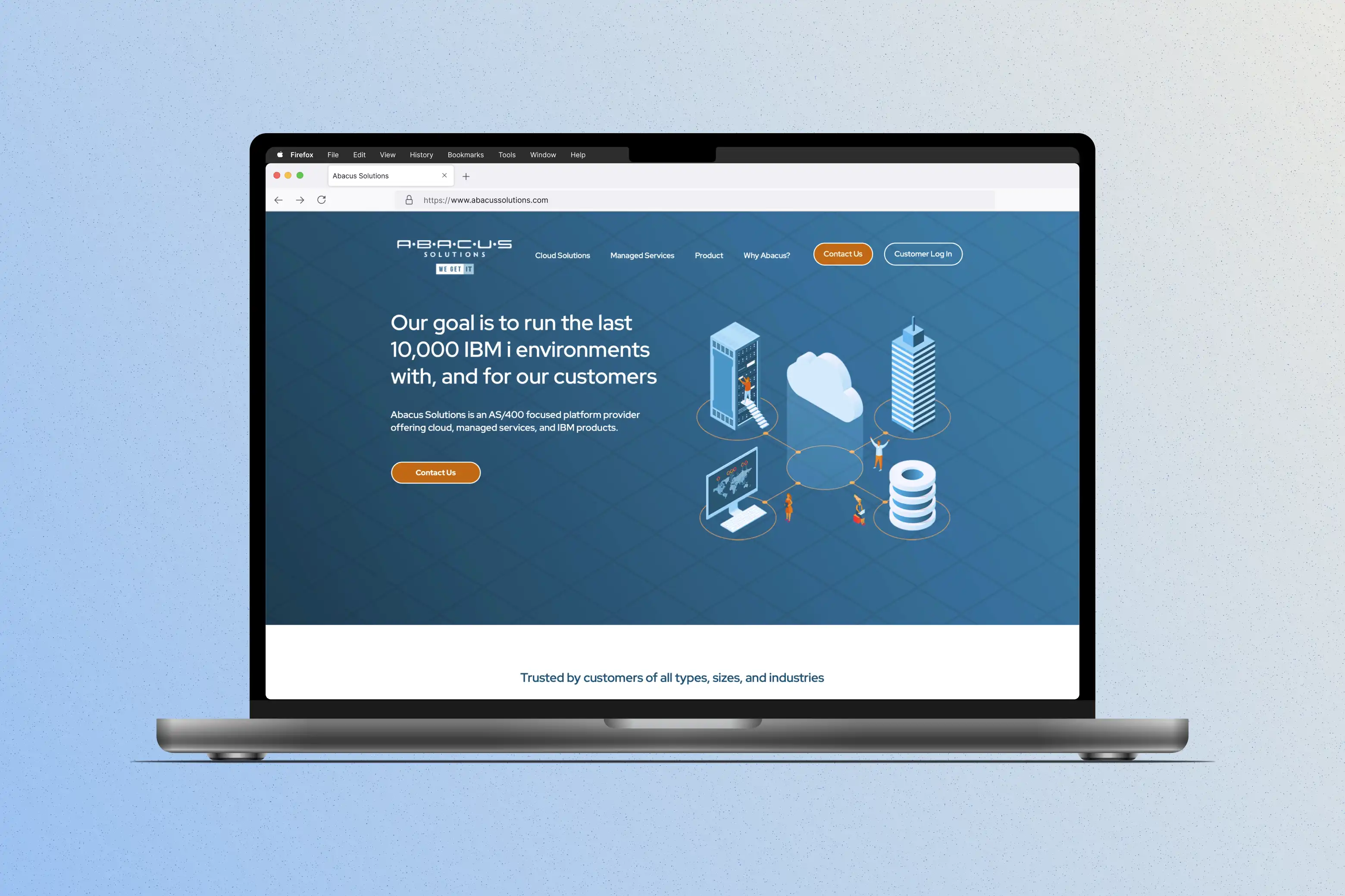
To make it easier for potential customers to find the right solution to fit their needs, we updated the site’s navigation menu with three primary categories: Cloud Solutions for customers who wanted to migrate to the cloud, Managed Services for customers who wanted to stay on-premise, and Product for the occasional customer who was only looking to purchase hardware. A fourth category, Why Abacus?, would house the About Us page, Leadership page, and any other miscellaneous company content.

A fresh coat of paint
Though creating a new visual aesthetic is arguably the most exciting part of any website redesign project, I wanted to ensure we weren’t prioritizing form over function. To keep UX at the center of the design process, I created several wireframes based on how I wanted visitors to experience the site, using them as a starting point to collaborate with the external partner’s design team on a final look.


An updated color palette was developed to give the site a more modern and trustworthy feel. Calls to Action (CTA) were highlighted in a bright orange to contrast against the mixture of blue and neutral backgrounds of the site.


Instead of relying on cliché images of data centers and engineers huddled around blue screens in darkened offices, I used a collection of stock vector art to create a new set of custom icons and graphics to give the site a bit of playful, visual appeal.

Focusing the message
When it came time to tackle content, we relied on two user personas to guide how we approached the new site’s messaging:
To appeal to the executive persona, we distilled our complex solution descriptions down to easy-to-understand, concise copy, reserving the technical details for marketing collateral documents that were shared with a customer’s engineers on exploratory conference calls.


New content sections on the homepage highlighted the flexibility of our solution offerings and helped build trust with customer testimonials and logos. Improved CTAs were used throughout the site and were tailored to each page to help improve CRO. Taking the time to hone our messaging accomplished several things:
Conclusions & Takeaways
Working with the support of a team of designers that took on more of the pixel-pushing responsibilities allowed me to focus on user experience as the site came together. Throughout the design process, I learned to balance the ideas of the external partner, stakeholder expectations, and what I thought was best for visitors to the site.